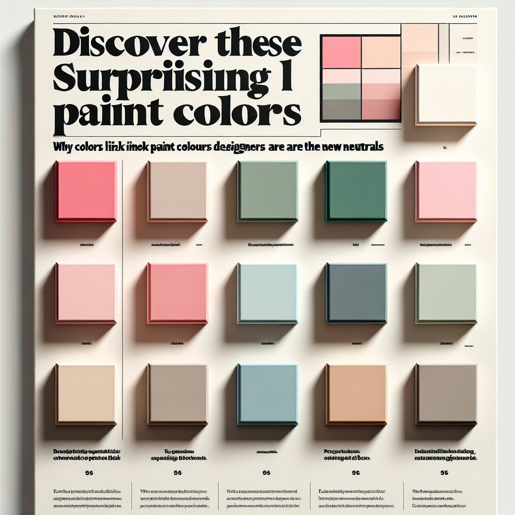
These subtle shades provide the same soothing effect as your favorite beige, but with added flair. While traditional neutrals remain popular, many other hues deserve recognition. Neutrals are visually calming and create a solid base for more vibrant colors. Consequently, muted colors like blush, mint, sage, butter, and peach function perfectly as neutrals. Interior designers have embraced this concept, often using these shades as alternatives to white, and sometimes even covering entire rooms with them.
Pink, in particular, has shed its frilly image to become a sophisticated neutral. It looks stunning when paired with green, as seen in a kitchen designed by the London firm Salvesen Graham.
In a bold twist, pale orange-pinks have a calming effect. Designer Hema Persad skillfully utilizes them in her Los Angeles bedroom, where limewashed peach complements brown and navy tones.
Properly applied, pale greens and blues can also serve as serene neutrals. A dining room designed by New York City’s Bespoke Only is both comforting and rejuvenating.